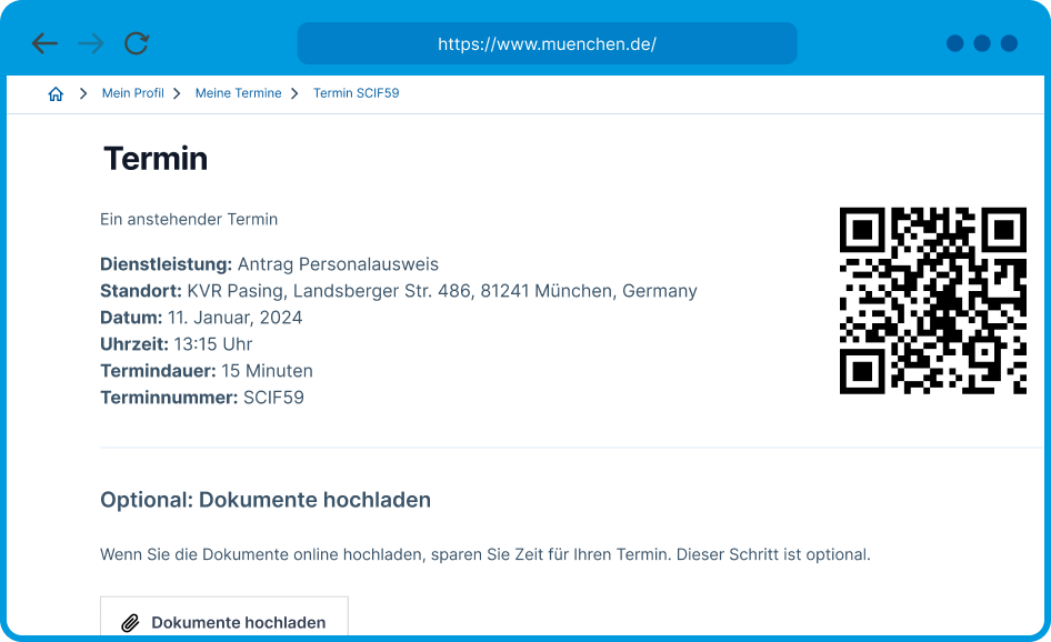
KVR Experience – Streamlining German National ID Application Process

An intuitive ID application platform, crafted for seamless use by Munich residents and streamlined efficiency in public administration.

About the client

The redesign of KVR Experience for Personalausweis was an exercise for my application for Digital Product School, Europe's most successful cross-functional training program, where I am currently working on a different project for the City of Munich while learning more about UX Design, Interaction Design and Product Management.

The problem

In Munich, applying for or renewing your German National ID (Personalausweis) can be a headache.

Among a very information-dense city’s website, you have to: find your way to book an appointment, confirm your appointment, and on the appointed day take your documents with you.

The overall process is not clear to Munich’s residents, and the lack of accessibility not only frustrated residents but also reflected inefficiencies within the city’s public administration system, indicating a pressing need for a user-centered redesign.

1. ”My Personalausweis is expiring soon, what do I do?”

2. ”Help me, Google... Oh, a direct link to an official site – super!”

3. ”Where do I click to renew my ID? There is only a button that takes me to a strange-looking site...”

4. (Half an hour later...) ”I can't find an appointment soon and this site is so confusing!”

Project goal

Understanding that people struggle with such essential public service, I defined the goal for this project:

Improve the online application process for a German National ID in Munich by making it more user-friendly and efficient.

Research

I interviewed users who went through the process of applying for a national ID to understand what made them unhappy or frustrated.

After analysis, I drew a map with each step a person takes to get their ID, pointing out where they get stuck or annoyed.

User Journey and Pain Points

I interviewed users who went through the process of applying for a national ID to understand what made them unhappy or frustrated.

After a thorough analysis, I drew a map with each step a person takes to get their ID, pointing out where they get stuck or annoyed.

Guiding insights

After analyzing paint points, I noticed a repetitive pattern – users encounter the most frustration with the booking system rather than other stages of the journey. Therefore I’ve chosen to focus my redesign on this particular scenario of the appointment booking process with the following insights in mind:

  • Make it easy for citizens to find the starting point to book an appointment
  • Reduce the number of repetitive activities, such as form-filling
  • Notify the user (over email/SMS) when a new time is available, rather than making them revisit the page
  • Make forms easier to understand
  • Help the citizen with alternatives when a close date is not possible in a specific office

Final proposals

Starting point is now easy to find

Currently
CTA was hidden between paragraphs and some users were not even sure if booking online is even possible.
Proposal
User can immediately see the button to book the appointment

User account means less repetitive steps and custom notifications

Currently

Currently, there is no login functionality available.

Proposal

A personal account offers:

  • pre-filled personal details for streamlined booking
  • subscription for appointment notifications
  • centralised appointment viewing
  • updates on application status (in future)

Clear forms and prominent overview of booked services

Currently
  • Users must navigate through all services provided by Bürgerbüro in order to find “Personalausweis” option.
  • Users are confused by the dropdown menus labeled “0, 1, 2”.
  • Lack of prominence in overview of booked services leads to accidental multiple bookings.
Proposal
  • “Antrag Personalausweis” preselected for users who previously visited the “Personalausweis” page.
  • Users still have an option to book other identification document services in the same session.
  • Clarification: “person” added next to the “+” icon for clarity on numbers.
  • Prominent overview bar on the right prevents accidental multiple service selection.

Help the citizen find an early and convenient appointment

Currently

Users must check each calendar individually for available slots.

Proposal
  • Users quickly find the soonest available appointment, which is particularly helpful as they often prioritize timing over location.
  • When logged in, map is displayed based on user’s stored address.
  • Each KVR location shows soonest appointment, eliminating the need for users to open all calendars.
  • User can subscribe for email notifications for sooner appointments under each office location.

Pre-filled forms and summary of booked services help orientation

Currently
  • User needs to type personal details each time he/she books an appointment.
  • Right-side overview lacked prominence, easily overlooked.
Proposal
  • Booking overview is prominent.
  • User contact details are already pre-filled because user is logged in.
  • User can still edit the fields, if something has changed.

Automatic booking confirmation for logged-in citizens

Currently

Too many steps:

  • User confirms appointment via email activation link. This email lacks booking overview.
  • User receives appointment confirmation via email.

User presents confirmation email to guard upon entering KVR which is not the most secure and efficient method.

Proposal
  • No email confirmation needed; user already logged in and verified identity.
  • User shows QR code upon entering KVR, making the experience more secure and efficient.

Video demo

This website stores cookies on your computer. Cookie Policy