Ease – site

Funky, experimental web design project for a healthy eating startup in Munich.
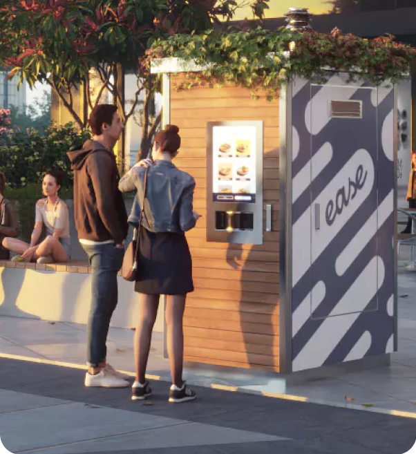
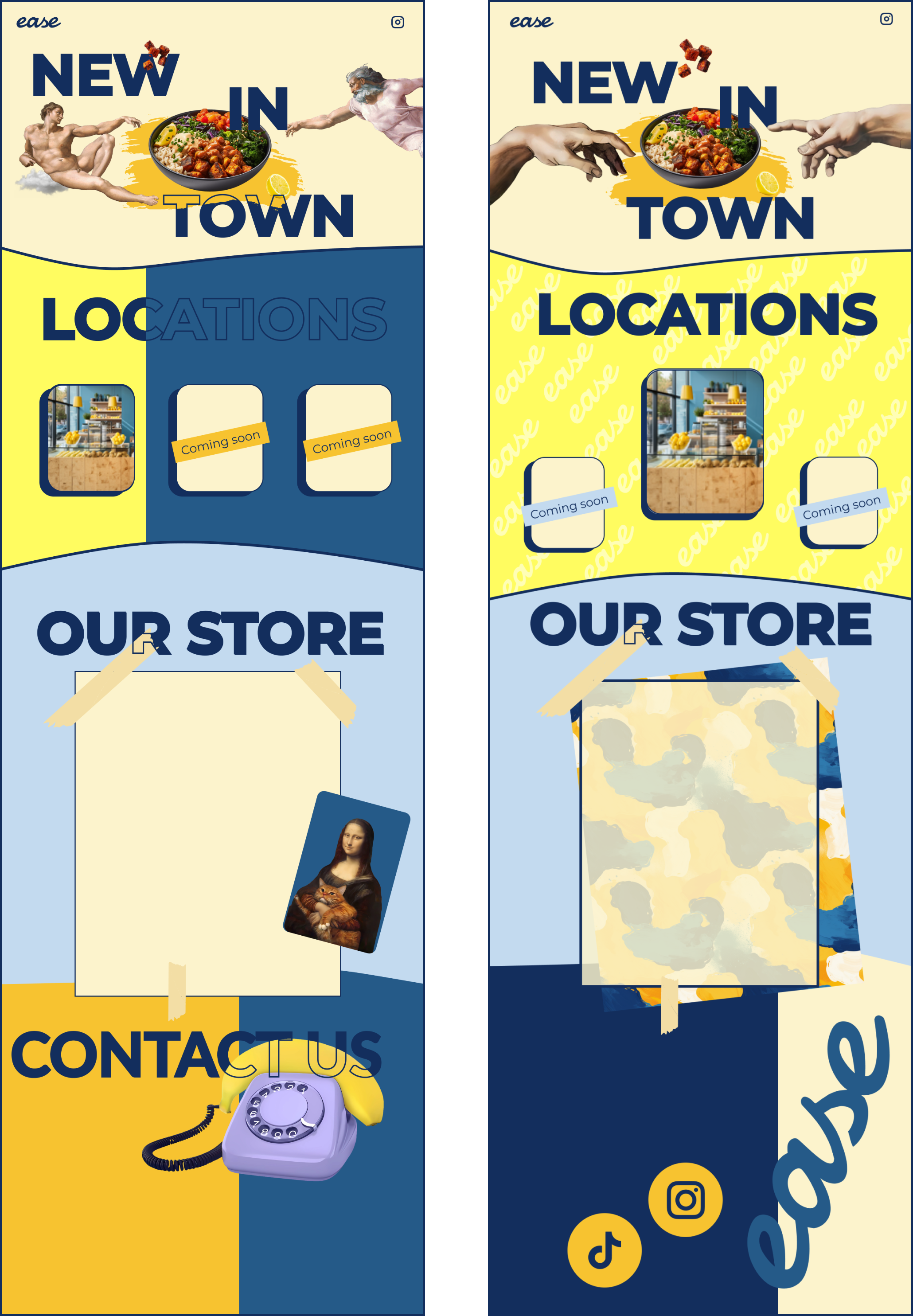
About the client

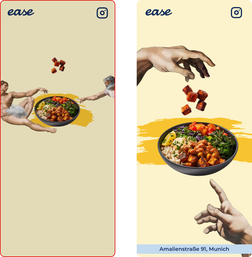
Ease is a startup from Munich, Germany, that provides personalized, healthy and convenient ready-to-eat meals by building the decentralized and automated food preparation infrastructure of tomorrow. Ease's robotics restaurants-in-a-box can be placed anywhere, such as at offices, universities, transport hubs or gyms, thereby seamlessly integrating into people's lives.

It’s live! Check it here: ease.day

01. Background

My role

I joined Ease as a volunteer as I was interested in advancing my UI/web design skills.

Ease is a startup growing within TU Munich Incubator. Its mission is to provide healthy eating options with the help of robotics.

As it is currently in the experimentation phase, they opened a cafe in Munich to get experience and insights working in the food industry and validate their business idea.

My role as a volunteer involves contributing to the development of their brand identity and design. The website is continuously evolving to address emerging needs and requirements.

Cafe Lost Weekend, Munich. Source: www.lostweekend.de

Customer Research

Ease’s experimental cafe location significantly influenced our design choices.

The founders opened a cafe in the university area because this area is suitable for running an experiment due to a high demand for healthy eating.

Considering key factors for design choices:

  • The cafe’s limited 6-month run as an experiment makes it necessary to rapidly attract customers
  • The area already offers numerous healthy options, requiring us to stand out, including in our design.
  • Our target audience consists mainly of health-conscious young people, students, and those with work-from-home habits. Thus, our space should inspire and provide a cozy environment.

Having these in mind, we came up with the idea to create an artsy space with a DIY feel.

02. Design

Inspiration

As art is essential for our cafe ambiance, I looked into how we could combine two concepts: food and art.

I also researched restaurant brands that made a blast with their marketing campaign and quirky designs.

Style, Color Palette and Typography

Even though most healthy food brands adhere to a soft green color tone, our concept of an “art cafe” was more important to our overall design. Thus, we decided to go for quirky, artsy, DIY, bold style.

I decided to convey art by integrating various shapes with different textures. This incorporates torn paper, paint brushes, and washy tapes.

Besides, making titles clash with art pieces can bring a soft touch of chaos to the whole composition but at the same aesthetic appeal.

First designs

Responsiveness

As our users will mainly check our landing page on mobile, it was essential to make the mobile design even more appealing than the desktop version.

The challenge was fitting the hero image on a smaller screen. Leaving the hero image in as it was on the desktop was not an option (left image). Thus, I made a static version with cropped-out elements (right image).

However, having a look at the ReadyMag functionalities and taking inspiration from the websites made on ReadyMag, I came across the animation feature called “Horizontal scroll.” The feature reveals content from left to right, while the user scrolling behaviour (from top to bottom) stays the same.

Final Design

It’s live! Check it here: ease.day

Consider opening the website on your mobile.

03. FUTURE CONSIDERATIONS

Ideas and Plans

In the nearest future, I will be adding more sections, for example, a section for a more detailed menu and a section for posts/reels from Instagram and TikTok.
This means that I will have a more consistent style of UI elements: buttons, CTAs (call-to-action), image carousels etc.

This website stores cookies on your computer. Cookie Policy